Overview
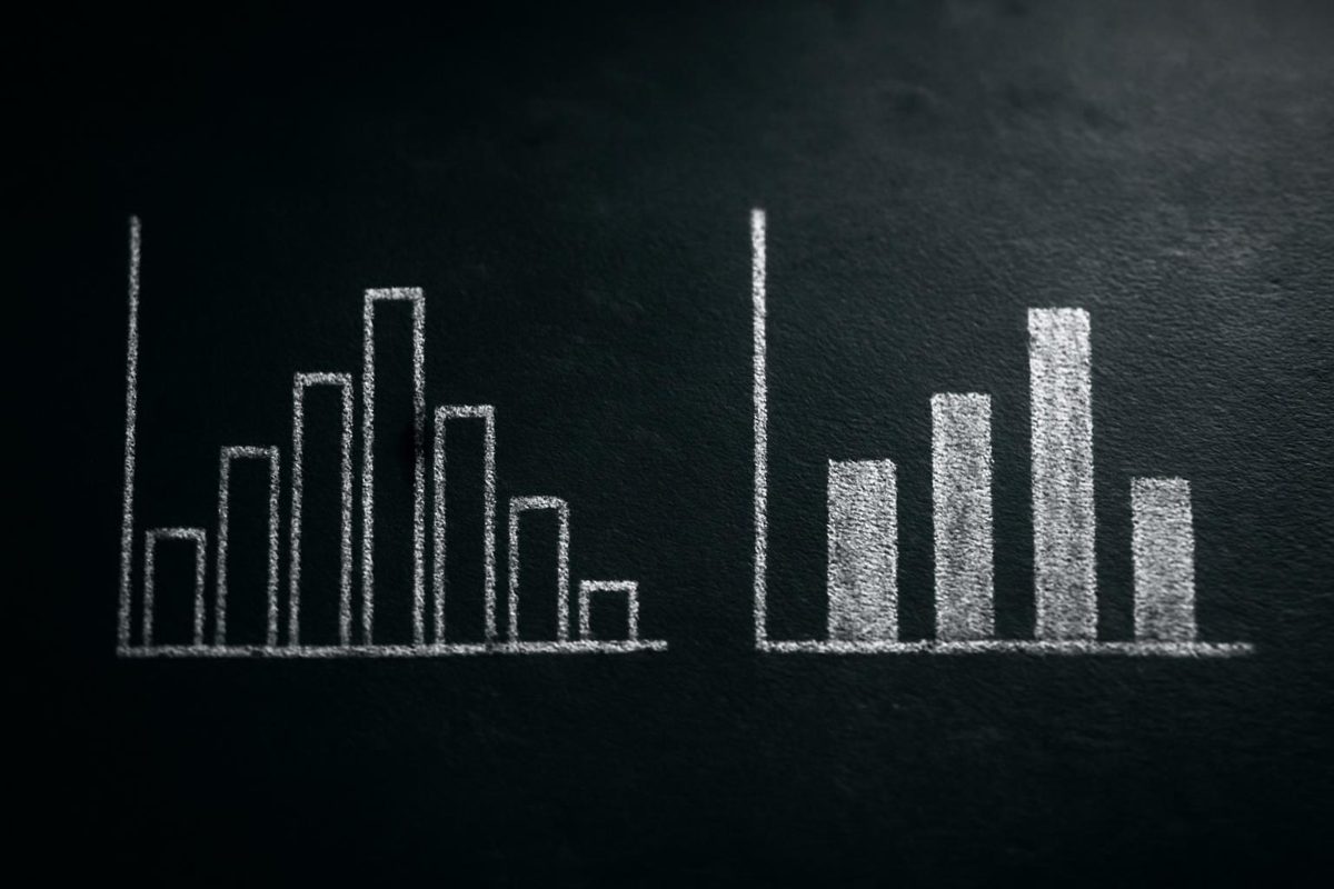
A bar chart compares values across distinct categories — product lines, regions, survey answers — while a histogram shows how numerical values are distributed by grouping them into bins across a continuous scale. The deciding factor is your variable: if it names or labels a group, use a bar chart; if it measures a quantity you can group into ranges, use a histogram. Get the variable type wrong and the chart itself becomes misleading, even if every number on it is accurate.
That single distinction — categories versus measured ranges — resolves most confusion around histogram and bar chart, but real datasets rarely arrive in perfectly labeled form. Ages, ratings, dates, and ID numbers all look numeric on the surface, and choosing the wrong chart for them can hide the pattern you’re trying to show. The rest of this guide walks through clear definitions, a practical decision matrix, and a worked example so you can make that call with confidence.
The short rule
Use a bar chart when your data separates into distinct, nameable categories — department, product, region, survey response. Use a histogram when your data is a set of measured numerical values that you’re willing to group into ranges to see the overall shape of the distribution. ThoughtSpot’s comparison of the two chart types states plainly that a bar graph compares numerical data across categories, while a histogram shows the distribution of a single, continuous dataset (ThoughtSpot). This rule handles the majority of everyday cases, but it isn’t absolute — ordinal ratings, rounded ages, and pre-binned data can sit in a gray zone covered later in this article.
Why the confusion happens
Both charts use rectangular bars, so at a glance they can look interchangeable — but the axis underneath each bar means something different. In a bar chart, each bar’s position is a label with no inherent numeric distance to its neighbor; in a histogram, each bar’s position is a numeric range on a continuous scale, so the bars’ order and width both carry meaning. Storytelling with Data frames the shared root of the confusion directly: both histograms and bar charts are composed of bars, but that’s about where the similarity ends, since histograms visualize quantitative or numerical data while bar charts display categorical variables (storytellingwithdata.com). Once you separate “what does the x-axis represent” from “how tall is each bar,” the two chart types stop looking like variations of the same thing.
What is a bar chart?
A bar chart is a chart that uses one bar per category to compare a value — a count, a total, an average, or a percentage — across those categories. BYJU’S describes a bar graph as the graphical representation of categorical data (BYJU’S), and that framing holds whether the categories are product names, regions, departments, or answer choices on a survey. A retailer comparing revenue by product category, a school comparing enrollment by grade, or a survey summarizing “yes/no/unsure” responses are all standard bar chart use cases because each x-axis value is a discrete label rather than a point on a numeric scale.
Bar chart, bar graph, and column chart terminology
In everyday use, “bar chart,” “bar graph,” and “column chart” refer to the same underlying chart type and are largely interchangeable — the difference is usually just orientation (horizontal bars versus vertical columns) rather than a different statistical purpose. ThoughtSpot’s glossary entry notes that a bar graph is also called a bar chart or column chart, and that it compares numerical data across categories (ThoughtSpot). What matters for this article is the boundary on the other side: none of those three terms is interchangeable with “histogram,” because a histogram serves a distinct statistical purpose — showing how a measured variable is distributed — rather than comparing separate categories.
What the x-axis and y-axis mean in a bar chart
In a bar chart, the x-axis (or y-axis, if bars run horizontally) lists categories with no required numeric relationship between them, while the other axis shows a value — a count, sum, average, or percentage — for each category. Because the categories aren’t inherently ordered, you’re free to arrange them however best serves the reader: by value from highest to lowest for a ranking, alphabetically for lookup, or in a fixed business order such as funnel stages. Labels should be specific enough to stand alone — “Northeast region” rather than a code the reader has to decode — since unclear category labels are one of the more common sources of bar chart misreading.
What is a histogram?
A histogram is a chart that groups a set of measured numerical values into intervals, or bins, and draws one bar per bin to show how many values fall into each range. Lumi AI’s comparison describes a histogram as revealing how continuous numerical data distributes across ranges, built by grouping data into intervals called bins (Lumi AI), and BYJU’S similarly defines a histogram as the graphical representation of quantitative data (BYJU’S). A histogram of customer ages, order amounts, or response times answers a different question than a bar chart: not “which group is largest,” but “what does the overall spread of this measurement look like — is it concentrated in the middle, skewed to one side, or spread out evenly?”
Bins, ranges, and class intervals
Because a histogram groups continuous values rather than listing discrete labels, the bin boundaries you choose directly shape what the chart shows. ThoughtSpot’s guide gives a concrete illustration: if your data ranges from 1 to 100, you might use 10 bins — 1–10, 11–20, and so on — to summarize the full range into readable groups (ThoughtSpot). Bin labels need to be clear and non-overlapping — a value of exactly 20 should unambiguously belong to one bin, not two — otherwise readers can’t tell which range a given bar actually represents. The takeaway: binning is not a cosmetic step, it’s part of the analysis itself, which is why the next section treats bin choice as a major interpretation issue rather than a footnote.
What the y-axis means in a histogram
The y-axis of a histogram typically shows how many values fall into each bin, but that “how many” can be expressed a few different ways depending on what you’re trying to communicate. A raw count shows the number of records in each bin; frequency and relative frequency show that count as a share of the total; percentage expresses the same share on a 0–100 scale; and density — used mainly when bins have unequal widths — scales the bar so that area, not just height, represents the proportion of data in that range. BYJU’S notes specifically that the area of the rectangular bars shows the frequency of the data in a histogram (BYJU’S), which is the detail that matters most once bin widths stop being equal — a point covered further in the binning section below. Before reading height alone as “more data,” check what the axis label actually says: count, percentage, and density can tell noticeably different stories from the same underlying values.
Histogram vs bar chart: the practical differences
Once you know your variable is either a category or a measured number, most of the remaining choices — spacing, ordering, binning — follow automatically from that one decision. The table below is a compact decision matrix for the most common comparison points between the two chart types, useful as a quick reference once you already know which family your data falls into.
| Aspect | Bar chart | Histogram |
|---|---|---|
| Data type | Categorical or discrete labels (product, region, department) | Continuous or measured numerical values (age, price, duration) |
| Question answered | Which category is largest, smallest, or how do categories compare? | What does the overall distribution or shape of the data look like? |
| X-axis meaning | Distinct labels with no inherent numeric order | A continuous numeric scale divided into bins |
| Bar order | Chosen for communication — by value, alphabetically, or by fixed order | Follows the numeric scale from lowest to highest bin |
| Spacing | Gaps between bars, signaling separate categories (BYJU’S) | Bars touch, signaling a continuous range (Lumi AI) |
| Binning | Not applicable — each bar is one category | Central to the chart — bin width and count shape what’s visible |
| Common mistake | Sorting ordinal or chronological categories by value, breaking their natural order | Choosing bin widths that hide or invent patterns in the data |
Data type
The first question to ask of any variable is whether it labels a group or measures a quantity, because that answer alone points you to one chart family or the other. A “region” field is categorical — Northeast, Midwest, West — and belongs in a bar chart; an “order total in dollars” field is a continuous measurement and belongs in a histogram if you want to see its distribution. Where this gets harder is discrete numerical data, such as the number of items in an order: Storytelling with Data notes that this kind of discrete numeric data can sometimes be handled by either chart type depending on the analytical purpose (storytellingwithdata.com), so treat “discrete but numeric” as a case that needs a second look rather than an automatic histogram.
Question answered
A bar chart answers a comparison question — which category ranks highest, how do two groups differ, what share does each segment hold — while a histogram answers a shape question: is the data concentrated around one value, spread evenly, skewed toward one end, or split across two peaks? Querio’s rule of thumb captures this split concisely: use bar graphs for categories and histograms for numerical data (Querio). If you catch yourself asking “which one is bigger,” you’re likely reaching for a bar chart; if you’re asking “how is this spread out,” a histogram is the better starting point.
Ordering and spacing
Bar chart order is a communication choice, not a data requirement — sorting by value highlights a ranking, chronological order suits time-based categories, and alphabetical order helps readers locate a specific item in a long list. Histogram order, by contrast, isn’t a choice at all: bins must run in numeric sequence because the x-axis is a continuous scale, and reordering them would misrepresent the data. This difference in ordering logic is also why the bars look different — Datylon frames the bar chart as the right tool “when your data consists of clear, separate categories and your goal is to compare those categories” (Datylon), and separate categories are conventionally drawn with gaps between bars, while a histogram’s touching bars visually reinforce that the underlying scale has no gaps between one bin and the next.
How to decide which chart to use
Before opening a spreadsheet or BI tool, it helps to run through a short, tool-neutral checklist rather than defaulting to whichever chart type is easiest to click. The same process works whether you’re building a chart by hand, in a spreadsheet formula, or through an automated chart generator.
- Name the variable type. Is it categorical (product, region), ordinal (rating, satisfaction level), a measured number (age, price, duration), a numeric-looking label (ID, ZIP code), a date or time period, or already pre-binned (an age group column someone else created)?
- State the question you’re answering. Are you comparing groups against each other, or trying to understand how one measured variable is spread across your whole dataset?
- Check whether binning changes the story. If the variable is a measured number, decide roughly how many bins make sense before you build the chart, not after — this avoids unconsciously picking bins that flatter a preferred conclusion.
- Confirm the ordering makes sense. Categorical bars can be sorted for clarity; histogram bins cannot be reordered without breaking their meaning.
- Look at the result with a skeptical eye. Does the chart answer the original question, or does it just look plausible? A chart that technically plots the data correctly can still mislead if the wrong type was chosen.
Start with the variable
Every dataset column falls into one of a handful of buckets, and naming that bucket up front prevents most chart-type mistakes before they happen. A field is categorical if its values are interchangeable labels (department names), ordinal if the labels have a natural order but no fixed numeric distance (satisfaction ratings), measured numerical if it’s a genuine quantity (weight, revenue, response time), numeric-looking categorical if the digits are really an identifier (customer ID, ZIP code), time-based if it represents a date or period, or already binned if someone upstream has grouped it into ranges (an “age group” column instead of raw ages). Identifying which bucket a column belongs to is the single highest-leverage step in this whole decision process, because every downstream choice — chart type, ordering, binning — follows from it.
Then ask what you want to compare or reveal
Once the variable type is settled, match it to the analytical goal: comparing distinct groups points to a bar chart, revealing the shape of a distribution points to a histogram, showing change over time points to a line chart or a chronologically ordered bar chart, and spotting outliers or summarizing spread compactly points toward the alternatives covered later in this article. The same dataset can support more than one chart depending on which column and which question you’re working with — a sales dataset might need a bar chart for “revenue by region” and a histogram for “distribution of order values” side by side. Treat the question, not just the data, as part of the decision.
Ambiguous data cases
The categorical-versus-continuous rule breaks down for several common real-world variables that look numeric but don’t behave like measured quantities, and treating them as automatic histogram candidates can produce a misleading chart. The sections below walk through the four ambiguous cases that come up most often in practice.
Ratings and ordered categories
A 1–5 star rating or a 1–10 satisfaction score looks like a number, but it usually behaves as an ordinal category: the values have a meaningful order, yet the “distance” between a 3 and a 4 isn’t necessarily the same as between a 4 and a 5 in the way that inches or dollars are. Treat ratings as ordinal categories in a bar chart — one bar per rating value, kept in their natural 1-through-5 order — unless your analysis specifically treats the scale as an interval measurement worth binning further. A bar chart preserves the exact count at each rating level; a histogram would force those five discrete values into ranges that don’t add clarity because there’s nothing between “3” and “4” to bin.
Ages, age groups, and rounded numbers
Raw customer ages — 24, 31, 45, 52 — are a measured continuous variable, and a histogram is well suited to showing how those ages are spread across your customer base, including whether the distribution skews younger or has a second cluster of older customers. Pre-grouped age bands such as “18–24,” “25–34,” or “35–44,” on the other hand, have already been binned by whoever created the dataset, and re-binning them again in a histogram adds no value — treat them as fixed categories and use a bar chart. The signal to watch for is whether the ranges already exist as labels in your data: if they do, you’re past the binning step, not before it.
Dates, months, and time periods
Whether time-based data calls for a bar chart, a histogram, or a line chart depends on what you’re comparing. Chronologically ordered bar charts work well for comparing discrete periods against each other — monthly revenue, quarterly headcount — as long as the bars stay in date order rather than being resorted by value. A line chart is usually the stronger choice once you’re emphasizing a trend across many points in sequence rather than comparing a handful of periods. A histogram of dates is rare and usually a sign that what you actually want is a distribution of some other measured field over time, such as how long support tickets take to resolve, rather than the dates themselves.
Numeric IDs and codes
Numeric-looking identifiers — customer IDs, order numbers, ZIP or postal codes — are categories wearing number costumes, and binning them into a histogram treats arithmetic distance as meaningful when it isn’t. A ZIP code of 10001 is not “close to” 10002 in any way that matters for grouping data; averaging or binning ID-like fields produces a chart that looks statistically legitimate while answering no real question. If a field’s role is to uniquely identify or label a record rather than measure something about it, keep it out of both histogram bins and bar chart value axes — it belongs on the label side of a chart, if it belongs on a chart at all.
Histogram binning choices that change the story
Bin width and bin count are not a minor formatting detail — they can change what pattern a histogram appears to show, sometimes dramatically, from the exact same underlying data. This is one of the areas where competitor explainers on histogram and bar chart tend to mention binning only in passing, even though it’s often the single biggest source of a misleading histogram.
Too many bins and too few bins
Too many bins spread your data thin, so each bar represents very few data points and the chart shows jagged, noisy ups and downs that look like meaningful structure but are really just sampling variation. Too few bins do the opposite: they compress everything into a small number of wide bars, smoothing over real patterns such as a second cluster of values or a sharp cutoff. Neither extreme is “wrong” in a strict sense — the chart still plots the data accurately — but both can lead a reader to draw a conclusion the underlying data doesn’t actually support, which is why it’s worth trying a couple of different bin counts before settling on one for a shared chart.
Unequal bin widths
When bins have unequal widths, reading bar height alone becomes misleading, because a wider bin can look taller simply from covering more range, not from containing proportionally more data. This is the practical reason the y-axis discussion above flagged density as a separate concept from raw count: BYJU’S notes that the area of the rectangular bars, not just the height, shows the frequency of the data in a histogram (BYJU’S), and that area-based reading only matters once bins stop being a uniform width. Unless there’s a specific reason to vary bin width — for example, matching pre-existing reporting brackets — equal-width bins are simpler for most readers to interpret correctly, so treat unequal widths as a deliberate, documented choice rather than a default.
Worked example: choosing charts from one dataset
The clearest way to see how these rules apply is to run one small dataset through several columns at once, since a single spreadsheet almost always contains a mix of categorical, ordinal, and measured fields. Imagine a retail dataset with five columns per row: product category, customer age, customer rating, purchase date, and revenue — a realistic shape for an order-level export from an e-commerce platform. Each column below leads to a different chart choice, which is the point: there is no single “right chart” for a dataset, only a right chart per question and per column.
Product category as a bar chart
Product category — “Electronics,” “Home Goods,” “Apparel,” “Sporting Goods” — is a textbook categorical field, so total revenue by category becomes a straightforward bar chart with one bar per category. Sorting the bars from highest to lowest total revenue turns the chart into a ranking that immediately shows which category drives the most sales, which is exactly the comparison question a bar chart is built to answer.
Customer age as a histogram
Customer age is a measured numerical field, so understanding whether your customer base skews younger or older calls for a histogram rather than a bar chart. Following the same logic as the 1–100 example earlier, you might bin ages into 10-year ranges — 18–27, 28–37, 38–47, and so on — and plot the count of customers in each bin; if the resulting bars cluster heavily around one or two bins with a long, thin tail on one side, that’s a skewed distribution the histogram makes visible in a way a bar chart of raw ages never could.
Rating as an ordinal bar chart
Customer rating, on a 1–5 scale, looks numeric but behaves as an ordinal category, per the ambiguous-case guidance above — so it becomes a bar chart with five bars, one per star rating, kept in their natural 1-through-5 order rather than sorted by count. This preserves the meaning of “5 is better than 4,” which a value-sorted bar chart or a histogram binning attempt would both obscure. Published as an interactive page, a dataset like this — with a categorical column, a measured column, and an ordinal column side by side — is close to what a tool such as TablePage generates automatically once a spreadsheet is uploaded, surfacing bar-chart-style and histogram-style views from the same table without requiring the uploader to pre-decide chart types column by column.
Common mistakes with histograms and bar charts
Most misleading histogram and bar chart pairs trace back to a small, repeatable set of errors rather than to bad data itself. Watching for these specific failure modes catches the majority of interpretation problems before a chart gets shared:
- Using a bar chart for raw continuous values. Plotting individual ages, prices, or durations as separate bars hides the overall distribution shape, including skew and multiple peaks, that a histogram would reveal.
- Over-binning a histogram. Choosing too many narrow bins turns ordinary sampling noise into what looks like meaningful structure.
- Under-binning a histogram. Choosing too few wide bins smooths away real patterns, such as a cluster of values or a sharp cutoff.
- Sorting ordinal or chronological categories by value. Re-sorting a rating scale or a sequence of months by size breaks the order that gives those categories their meaning.
- Treating numeric IDs as measurements. Binning ZIP codes, order numbers, or other identifiers into a histogram implies a numeric relationship that doesn’t exist.
- Confusing stacked or grouped bar charts with histograms. A stacked bar chart splits each category into sub-segments; a histogram groups a single numeric variable into ranges — they solve different problems and aren’t interchangeable, even when both show tall, touching-looking bars.
- Unclear or overlapping bin and category labels. A histogram bin boundary that isn’t obvious, or a bar chart category label that requires a lookup table to decode, undermines the chart no matter how well the data itself was chosen.
When another chart may be better
Not every dataset needs to be forced into a histogram-or-bar-chart binary — several close alternatives can answer the same underlying question more clearly for specific situations. A line chart usually outperforms a chronological bar chart once you’re tracking a trend across many time points rather than comparing a handful of discrete periods, since the connecting line emphasizes direction and rate of change. A box plot condenses a distribution into its median, quartiles, and outliers in a fraction of the space a histogram needs, which is useful when you’re comparing spread across several groups side by side rather than examining one distribution in detail. A dot plot can show every individual value in a small dataset without the binning decisions a histogram requires, which matters when sample sizes are too small for bins to be statistically meaningful. A density plot smooths a histogram’s bars into a continuous curve, trading some of the histogram’s precision for a shape that’s easier to compare across multiple overlapping groups. None of these replaces the bar chart or histogram outright — they’re worth reaching for when the specific question (trend, spread-across-groups, individual values, smoothed comparison) fits them better than a standard bar chart or histogram would.
Creating histograms and bar charts from spreadsheet data
Turning a raw spreadsheet column into either chart follows roughly the same tool-neutral sequence, regardless of whether you’re working in a spreadsheet program, a BI tool, a programming language, or a dataset publishing platform:
- Identify the variable type for the column you’re charting, using the categorical, ordinal, measured, numeric-looking-categorical, time-based, or pre-binned buckets described earlier.
- Decide whether the column needs aggregation or binning — categorical columns typically need a count or sum per category; measured numerical columns need bin boundaries chosen before the chart is built.
- Set what each axis actually represents, including whether the value axis shows a count, a percentage, or another aggregation, so the chart’s label matches what’s plotted.
- Choose an ordering appropriate to the chart type — sorted, chronological, or natural order for a bar chart; strict numeric bin order for a histogram.
- Check the finished chart against the original question before sharing it, confirming the chart type still matches the variable and the comparison or distribution question you set out to answer.
For readers who want to skip manual chart-building, TablePage supports this workflow at the data-handling stage: its upload flow accepts CSV, TSV, XLSX, or XLS files dragged directly into the browser, and generates a public dataset page with charts, AI-generated insights, and a filterable table — accessible to anyone viewing the link with no signup needed (tablepage.ai/demo). That doesn’t remove the need to think through variable type and binning first, but it does mean the mechanical step of turning a column into a chart doesn’t require separate charting software once the underlying data decisions above are made.
FAQs
How do I know if my data should be shown as a histogram or a bar chart? Check whether the column holds category labels or measured numbers. Category labels — product, region, department — point to a bar chart; measured numbers you’re willing to group into ranges — age, price, duration — point to a histogram.
What is the difference between a bar chart, bar graph, and column chart? These three terms describe the same chart type in everyday use, differing mainly in orientation, and none of them is interchangeable with a histogram, which serves a distinct statistical purpose of showing a distribution rather than comparing categories.
Can discrete numerical data be shown in a histogram, or should it use a bar chart? It can go either way depending on the analytical purpose — discrete counts, such as items per order, sometimes work as a histogram to show spread and sometimes work better as a bar chart if there are only a handful of distinct values to compare directly.
How do I choose the right bin size for a histogram? Start from a reasonable number of bins for your data’s range — the earlier 1–100 example split into ten 10-unit bins — then check whether narrower or wider bins change the visible pattern before settling on a final version, since bin choice is a genuine analytical decision, not a formatting default.
What does the y-axis mean in a histogram? It usually shows a count, but can also show frequency, relative frequency, or percentage, and shifts to density — where area rather than height represents proportion — once bin widths are unequal.
Are age groups better shown as a histogram or a bar chart? Raw ages call for a histogram since they’re a measured continuous variable; already-grouped age bands, such as “18–24,” call for a bar chart since the binning decision has already been made.
When should bars in a bar chart be sorted from highest to lowest? When the goal is a ranking — which category is largest or smallest — value-sorted bars make that comparison immediate; ordinal or chronological categories should keep their natural order instead.
Can a histogram have gaps between bars? Conventionally, no — histogram bars touch to signal that the underlying scale is continuous (Lumi AI), while bar chart bars keep gaps to signal separate, distinct categories (BYJU’S).
Is a stacked bar chart ever the same as a histogram? No — a stacked bar chart splits each category into sub-segments of a second categorical variable, while a histogram groups one numerical variable into ranges; the two solve different problems even when both produce tall, adjacent-looking bars.
Should time-based data use a bar chart, histogram, or line chart? A chronologically ordered bar chart suits comparing a handful of discrete periods; a line chart suits an ongoing trend across many time points; a histogram of dates is rare and usually signals that the real distribution question is about a different measured field.