Overview
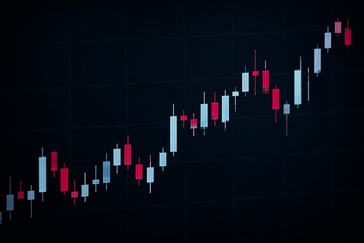
A candlestick chart is a way of visualizing open, high, low, and close (OHLC) price data over time, where each candle represents one time interval — a minute, an hour, a day, or longer. The candle’s body shows the relationship between the opening and closing price, while thin lines called wicks (or shadows) extending above and below the body mark the high and low reached during that interval. Candlestick charts are used mainly in financial markets and technical analysis because they pack four price points into a single visual shape, letting a reader scan price action, volatility, and short-term sentiment across many periods at once. The deciding factor in whether this format is useful for a given dataset is simple: if the data has genuine open, high, low, and close values for each period, a candlestick chart adds information a line chart cannot show; if it doesn’t, a candlestick chart adds visual complexity without adding insight.
What a candlestick chart shows
A candlestick chart is the sequence of candles plotted across a timeline; a candlestick (or candle) is the single OHLC unit for one period; and a candlestick pattern is an interpreted arrangement of one or more candles that some traders use to reason about possible reversals, continuations, or indecision. Keeping these three ideas separate matters because a beginner can read a chart and understand a single candle without yet being able to — or needing to — recognize named patterns. Candlestick-style price charting has a long history, with some financial reference sources tracing candlestick charts back to the 1700s, according to Spotfire, and the format is now used across currencies, securities, and derivatives markets.
Candlestick chart vs. single candle vs. candlestick pattern
Think of the chart as the whole conversation, the candle as one sentence, and the pattern as a phrase built from a few sentences that some readers interpret as meaningful. A single candle tells you what happened during one interval: whether price closed higher or lower than it opened, and how far it swung in between. A pattern — such as two or three candles arranged a certain way — is a higher-level interpretation layered on top of that raw data, and it carries more assumptions than the candle itself. Because of this layering, it helps to fully understand a single candle before treating any multi-candle arrangement as a signal:
- Candlestick chart — the full sequence of candles across a chosen timeframe.
- Single candlestick — one period’s open, high, low, and close, shown as a body and wicks.
- Candlestick pattern — an interpreted shape formed by one or more consecutive candles.
The four prices behind every candle
Every candle is built from exactly four numbers: the open (the first traded price of the interval), the high (the highest price reached), the low (the lowest price reached), and the close (the last traded price of the interval). The body of the candle is drawn between the open and the close, and its color or fill typically shows whether the close was higher than the open (often shown as a hollow or light-colored body) or lower (often shown as a filled or dark-colored body). The wicks, or shadows, extend from the top and bottom of the body to the high and low of the period. As the CME Group explains, candlestick charts break price down visually into these two main parts — the body and the wick — which meet at the open and close.
How to read a candlestick from OHLC data
Reading a candle is a matter of comparing four numbers and translating the result into a shape: locate the body between the open and close, then measure how far the wicks extend beyond it. The color and length of the body indicate direction and conviction over that interval, while the wicks show how much the price moved away from the close before returning. This is a mechanical exercise before it is an interpretive one — the shape follows directly from the four inputs, and only afterward does context determine what, if anything, it suggests about buyer or seller pressure.
Worked example: turning OHLC values into a candle
Suppose a daily candle for a hypothetical stock has these values: open $50.00, high $52.50, low $49.20, and close $51.80. Working through the numbers step by step:
- Body direction and size: close ($51.80) is higher than open ($50.00), so the candle is bullish, with a body spanning $1.80.
- Upper wick: high ($52.50) minus close ($51.80) equals $0.70, meaning price pushed $0.70 above the close before pulling back.
- Lower wick: open ($50.00) minus low ($49.20) equals $0.80, meaning price dipped $0.80 below the open before recovering.
- Total range: high minus low equals $3.30, and the $1.80 body makes up roughly 55% of that range.
From these numbers alone, you can say that buyers held most of the day’s gains into the close and that the candle shows a moderate — not extreme — amount of intraday give-back on both ends. What you cannot say from this single candle is why the price moved, whether the move will continue, or how it compares to typical volatility for this instrument; those questions require looking at the surrounding candles, volume, and broader context, which later sections in this article address directly.
What body size and wick length can suggest
A long body relative to the total range generally indicates that one side (buyers or sellers) was in control for most of the interval, while a small body suggests the open and close ended up close together despite possible intraday movement. A long upper wick with a small body suggests price rallied and then gave back most of the gain, and a long lower wick suggests the reverse — a dip that was mostly recovered. A candle where the open and close are nearly identical is often called a doji-like candle and is generally read as indecision rather than a clear directional signal. None of these shapes should be read in isolation: the same body-and-wick combination can mean different things depending on whether it appears after a strong trend, inside a tight range, or during unusually thin trading, which is why timeframe and context are covered next.
Timeframes, sessions, and gaps change the story
The same OHLC structure can represent very different things depending on the length of the interval and the market conditions during which it formed. A one-minute candle and a weekly candle both have an open, high, low, and close, but they answer different questions — one is about short-term order flow, the other about a broader multi-day trend — so comparing patterns across timeframes without adjusting expectations is a common source of confusion. Session boundaries, time zones, and whether a market trades continuously or in defined hours further change what a candle can and cannot represent.
One-minute, daily, weekly, and monthly candles answer different questions
Shorter candles capture more noise and fewer completed decisions, while longer candles smooth out intraday swings but delay how quickly new information shows up on the chart. According to Domo’s candlestick chart guide, each candlestick can represent a specific time interval such as one minute, one hour, one day, or one week, and the guide notes that candlestick charts are less effective on very short timeframes like one-second charts, since at that granularity the body and wicks mostly reflect noise rather than meaningful price discovery. A daily candle is generally more useful for spotting a multi-day trend, while an intraday candle is more relevant for understanding what happened within a single session — neither timeframe is universally “better,” and the right choice depends on the question being asked.
Session boundaries, extended hours, and 24/7 markets
Different markets keep different hours, and that difference changes how gaps and overnight candles should be read. Stocks typically trade during defined exchange hours, with the possibility of pre-market and after-hours activity depending on the platform and data feed; futures often trade in longer, sometimes near-continuous sessions; and crypto markets trade nearly around the clock, which means crypto charts rarely show the same kind of open-to-open gaps that appear on a stock chart after a weekend or overnight closure. Because candlestick charts can be used across many financial instruments — stocks, forex, commodities, and more — with the same visual format applied to different underlying market structures, as noted by CenterPoint Securities, a reader comparing candles across asset types should check whether the chart includes extended-hours data, what time zone it is displayed in, and whether gaps reflect a genuine trading halt or simply a difference in session boundaries. Skipping this check is one of the more practical ways beginners misread a candle’s significance.
Common candlestick patterns and what they can indicate
Candlestick patterns are named arrangements of one or more candles that some traders use to reason about possible reversals, continuations, or momentum shifts, but no pattern name changes the underlying rule that context determines reliability. This section covers a few widely referenced single- and multi-candle examples at a level useful for recognizing them, without treating the list as a complete or standalone trading signal set.
Single-candle signals: doji, hammer, shooting star, and marubozu
A doji forms when the open and close are very close together, producing a small or nonexistent body, and is generally read as a moment of indecision between buyers and sellers. Reference sources describe multiple doji variants — Spotfire lists Dragonfly, Gravestone, and Long-legged as three common types, distinguished by where the small body sits relative to the wicks. A hammer has a small body near the top of the range with a long lower wick, typically noted after a decline; a shooting star has a small body near the bottom of the range with a long upper wick, typically noted after an advance; and a marubozu has little or no wick at all, meaning the open or close sat at (or near) the extreme of the period. In every case, the same shape can appear in a trending market, a ranging market, or a low-liquidity period, and its meaning shifts accordingly — which is why a single candle is rarely treated as a complete signal on its own.
Multi-candle patterns: engulfing, morning star, evening star, and three-candle formations
Multi-candle patterns combine two or three consecutive candles into a single interpreted shape. A bullish (or bearish) engulfing pattern occurs when one candle’s body fully covers the prior candle’s body in the opposite direction, and it is often read as a shift in short-term control. The morning star and evening star are three-candle formations: Groww describes the Morning Star as a three-candlestick pattern often associated with a potential bottoming process, typically featuring a large down candle, a small-bodied middle candle, and a large up candle. A related two-candle example, the piercing line, is described by the same source as closing above the midpoint — the 50% mark — of the previous bearish candle’s body, which is used to gauge how much of the prior decline was reclaimed. As with single-candle signals, these formations describe a shape in the data, not a guaranteed outcome, and the next section covers how to check whether a pattern deserves attention.
Confirmation, invalidation, and false signals
A practical way to weigh any candlestick signal is to work through four checks in order: context first, the candle itself second, confirmation third, and invalidation fourth. Context means knowing the trend, range, volume, and general volatility surrounding the candle; the candle is the shape itself; confirmation is whatever additional evidence — a follow-through candle, a volume increase, a level of support or resistance — supports the initial read; and invalidation is the specific condition under which you would conclude the read was wrong. Skipping straight to a pattern name without doing the first and third steps is one of the more common ways candlestick interpretation goes astray.
Why patterns can fail
Short timeframes generate a large number of candle shapes purely from noise, so a pattern that looks meaningful on a one-minute chart may simply reflect random order flow rather than a shift in sentiment. Low liquidity is a related problem: in thinly traded periods, a single large order can produce a long wick that looks like strong rejection but may not represent broad participation. Sudden news events, data errors such as bad ticks, and changing volatility regimes can also produce candle shapes that resemble classic patterns without the underlying conditions those patterns are usually associated with. None of this means candlestick patterns are never useful — it means their reliability depends heavily on the liquidity, timeframe, and market conditions in which they appear, which is why treating a pattern name as a standalone signal tends to overstate its precision.
A beginner workflow for checking a candlestick signal
Before treating any candle or pattern as meaningful, it helps to work through a short, repeatable checklist rather than reacting to the shape alone:
- Choose the timeframe that matches the question you’re asking (intraday behavior versus multi-day trend).
- Identify the surrounding context — is the market trending, ranging, or unusually volatile?
- Read the candle itself: body direction, body size relative to the range, and wick length on each side.
- Look for confirmation from volume, a nearby support or resistance level, or a follow-through candle.
- Define what would invalidate the read — a specific price level or a lack of follow-through — before deciding the signal is meaningful.
Working through these steps in order keeps the focus on the underlying price data rather than on pattern-matching a shape to a name, and it applies whether the candle appears on a stock, forex, or crypto chart.
Candlestick chart comparison: when to use alternatives
Candlesticks are one of several ways to visualize the same OHLC data, and each alternative trades off detail, readability, and noise reduction differently. Hollow candlesticks use an open or filled body specifically to show whether the current close is higher or lower than the prior close (rather than the candle’s own open), which some readers find clarifies short-term momentum. Heikin-Ashi candles recalculate each open and close using averages from the previous candle, producing a smoother-looking chart that can make trends easier to see but that no longer reflects each period’s literal traded open and close. OHLC bar charts show the same four data points as a candlestick but with tick marks instead of a filled body, which some readers find less visually noisy at the cost of making direction less immediately obvious. Renko charts abandon time-based intervals altogether, plotting bricks only when price moves a fixed amount, which removes time and volume information from the picture. A line chart, typically connecting closing prices only, discards open, high, and low entirely in exchange for a simpler, less cluttered trend view.
What each chart type reveals and hides
The table below summarizes what each format shows well and where it falls short, to help match the visualization to the data and the question being asked.
| Chart type | Shows exact OHLC | Best for | Key limitation |
|---|---|---|---|
| Standard candlestick | Yes | Reading open/close relationship and intraday range together | Can look noisy on short timeframes or thin data |
| Hollow candlestick | Yes | Highlighting momentum vs. the prior close | Adds a second visual rule beginners must learn |
| Heikin-Ashi | No (smoothed/derived) | Visualizing trend direction with less noise | Open/close no longer match actual traded prices |
| OHLC bar | Yes | Compact display of the same four values | Direction is less visually obvious than a filled body |
| Renko | No (price-based bricks) | Filtering out small, time-based noise | Loses timing and volume context entirely |
| Line chart (close only) | No | Simple, clean long-term trend summaries | Hides intraday range, gaps, and volatility |
Choosing among these options comes down to what the data supports and what the reader needs to see: if the goal is a clean long-term trend summary, a line chart communicates it with less clutter; if the goal is understanding intraday range and directional conviction from real OHLC values, a standard candlestick or OHLC bar keeps that detail intact; and if the goal is a smoothed visual read of trend direction, Heikin-Ashi or Renko can help, provided the reader understands that both alter the underlying values in the process.
How to create a candlestick chart from a dataset
Building a candlestick chart from a dataset starts with making sure the underlying data actually has the four required fields for each period, since a candlestick chart cannot be constructed from close-price-only data. Beyond the raw fields, consistent interval and session rules matter as much as the values themselves — mixing timeframes or inconsistent time zones within one dataset will produce a chart that misrepresents the data it’s built from. Tools built for publishing spreadsheet data, such as TablePage, let a user upload a spreadsheet and generate a shareable page with charts and a filterable table without needing custom charting code, which is a relevant option once an OHLC dataset is clean and ready to present.
Required fields for a clean OHLC dataset
At minimum, a candlestick-ready dataset needs the following fields for each row:
- A timestamp or period identifier (date, or date and time, depending on the interval).
- Open — the first price of the period.
- High — the highest price reached during the period.
- Low — the lowest price reached during the period.
- Close — the last price of the period.
- Volume (optional but useful) — the number of shares, contracts, or units traded during the period.
Each row should represent the same interval length and the same session rules (for example, consistently including or excluding pre-market and after-hours trades) so that candles are comparable to one another across the dataset. Once a dataset like this is assembled — for instance, in a CSV, TSV, XLSX, or XLS file — a platform such as TablePage can turn it into a public dataset page: the product’s own workflow description is to upload the spreadsheet, get a shareable link that instantly generates a public dataset page, and let anyone explore the resulting charts, insights, and a filterable table without signing up. That kind of workflow is aimed at publishing and exploring a dataset rather than at generating trading signals, which fits a reader who needs to present OHLC data responsibly rather than act on it in real time.
Data-quality checks before charting
Before generating any chart, it’s worth checking the raw data for the kinds of issues that quietly distort candlestick shapes:
- Missing periods, which can make a chart look like it has gaps that aren’t real market gaps.
- Duplicate timestamps, which can create overlapping or conflicting candles for the same period.
- Adjusted versus unadjusted historical prices, which can change past candle shapes depending on how corporate actions like splits are handled.
- Outlier or bad-tick values that produce an unrealistically long wick or an implausible open or close.
- Low-liquidity candles, where very few trades occurred and a single print may not represent genuine price discovery.
- Inconsistent time zones across rows, which can misalign candles relative to actual session boundaries.
Running through this list before charting is a small amount of upfront work that prevents a misleading candle from being read as a meaningful signal later.
When not to use a candlestick chart
A candlestick chart is the wrong choice when the underlying data doesn’t actually have open, high, low, and close values — forcing a single value (like a daily average or a running total) into a candlestick shape adds visual complexity without adding real information. It’s also often not the best choice when the goal is a simple, high-level trend summary over a long period, since a line chart of closing values communicates a multi-year or multi-decade trend with far less visual noise. Candlestick charts also become less useful when trading is so sparse that most candles are formed from very few data points, since thin liquidity can make individual candles more reflective of a handful of trades than of genuine price consensus. In each of these cases, matching the chart type to the actual structure and density of the data — rather than defaulting to candlesticks because they’re the familiar format for financial data — produces a clearer and more honest visualization.
Key takeaways
A candlestick chart translates open, high, low, and close data into a body-and-wick shape for each period, giving readers a compact view of direction, range, and short-term price action. A single candle, a candlestick pattern, and the full chart are related but distinct concepts, and understanding a candle mechanically — as in the worked OHLC example above — should come before treating any pattern as a signal. Timeframe, session boundaries, and data quality all change what a candle represents, so the same shape can mean different things on a one-minute chart versus a weekly chart, or on a continuously traded crypto market versus a session-based stock market. Patterns can fail, especially on noisy short timeframes or in thin liquidity, which is why a context-first, confirmation-based workflow is more useful than reading pattern names in isolation. Finally, the right chart format — standard candlesticks, hollow candles, Heikin-Ashi, OHLC bars, Renko, or a plain line chart — depends on what the underlying data actually contains and what question the reader is trying to answer, and tools like TablePage’s dataset-to-page workflow can help present a clean, well-checked OHLC dataset once that choice has been made.